 Have you noticed that tablets are starting to feel a little mundane? You’ve got a rectangular slate with a large display while the manufacturer’s bragging about how it’s some fragment of a millimeter thinner or some fraction of an ounce lighter than the last. Sure, we see improvements in things like screen quality and processing power, but not many companies are doing anything drastically different.
Lenovo Yoga Tablet
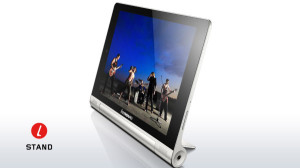
Lenovo wants to change that. The company’s new Yoga Tablet takes a bold risk by shunning the standard slate approach and building a tablet around an unusual cylindrical battery – which, in addition to boosting the device’s stamina, serves as a multipurpose stand. It’s an innovative idea that adds unique value to the product and makes it stand out from the pack.
But form alone isn’t enough to make a tablet worth buying – and that’s where Lenovo runs into trouble.
First, the facts: The Yoga Tablet is available in an 8-in. size with 16GB of internal storage for $249 or 32GB for $269; it’s also available in a 10-in. size with 16GB for $299 or 32GB for $309. Aside from the differences in size and storage, all of the models are exactly the same. The model I tested was the 8-in. 16GB version.
Body and display
The Lenovo Yoga Tablet looks like a normal tablet at its top (when held in landscape orientation). That’s where the standard design stops: The device gets gradually thicker as you progress toward the bottom, leading up to its cylinder base. On the 8-in. model, the cylinder is about the thickness of a roll of nickels.
The base causes the tablet to be weighted heavily toward its bottom. It’s actually quite comfortable to hold in the landscape position: The cylinder makes a nice foundation to grasp with your hands or rest in your palms, and the weight distribution makes it feel very natural in that orientation.
Where the cylinder really shines is in its stand capabilities: A sturdy metal panel pulls out from the device’s rear side. You can deploy that stand all the way down to prop up the tablet at a 110-degree angle, causing the device to sit almost perpendicular to a table. You can also adjust it to sit at a lower angle – up to 135 degrees – so you can view content comfortably from any height.
The stand works in reverse, too: If you flip the tablet upside-down, it allows you to use the screen in what Lenovo calls “tilt” mode. The stand is at the top of the device in this position and causes the screen to be lifted up from a table, which is a nice touch if you’re typing or actively engaging with content.
Unfortunately, things go downhill from there. The screen on the Lenovo Yoga Tablet is downright dismal – a 1280-x-800 panel that looks awful compared to the higher-end technology we’re used to seeing on tablets today. Colors are dull and washed out, and lines on the screen – in text, icons and images – are actually visibly fuzzy instead of being crisp and sharp. That’s hard to forgive, especially when you look at it next to the outstanding 1080p display on Google’s Nexus 7, which actually costs 20 bucks less than the Yoga’s cheapest model.
The Yoga does have commendable speakers: The dual front-facing speakers are enhanced with Dolby audio technology.
The tablet has a standard micro-USB port on its left edge and a volume rocker on its right. The power button is on the left side of the cylinder, while the headphone jack is on the right end of that base. There is no HDMI-out capability.
Under the hood
Lenovo’s Yoga Tablet runs a 1.2GHz quad-core MediaTek ARMv7 processor along with 1GB of RAM. Its performance is disappointing: Swiping through home screens is jerky, animations throughout the system are consistently jittery, and apps are slow to load. All in all, this just isn’t a snappy device.
It does excel in battery life, however: The Lenovo Yoga is listed for a full 18 hours of use per charge. No question about it, this thing’s stamina is impressive; it’s the kind of tablet you can use for a few days without ever thinking about plugging it in.
Depending on which Yoga model you buy, you’ll get either 16GB or 32GB of internal storage, about 4GB of which is taken up by the operating system and various preinstalled applications. The Yoga Tablet also has a micro-SD card slot (hidden beneath its stand) that allows you to add up to 64GB of external storage.
There aren’t many other bells and whistles to note: The Yoga doesn’t have support for near-field communication (NFC), wireless charging or IR blasting. In the U.S., it’s available only with Wi-Fi – no mobile data connectivity – and supports 802.11 b/g/n.
The tablet has a 1.6-megapixel “HD” camera on its front for video chatting along with a mediocre 5-megapixel shooter on its back.
The software
The Yoga Tablet runs custom Lenovo software based on the Android 4.2 Jelly Bean operating system. The key phrase there is “based on” – while the Yoga’s user interface may look like Android at a glance, Lenovo made some puzzling changes to the software that significantly hurt its usability.
First, the company completely removed the app drawer – the area on Android devices that typically holds a grid of all installed applications – and instead awkwardly combined it into the home screen itself. When you install a new app, an icon for it is added directly onto the home screen. If you try to remove the icon from the home screen, you’re prompted to uninstall the application.
The result is a confusing mess of shortcuts, widgets and apps (all of them) haphazardly thrown together in a single spot. It seems like Lenovo wanted to make the tablet feel like iOS but still leave in some Android-centric touches — a misguided effort that simply doesn’t work.
To my bewilderment, Lenovo also decided to add a legacy overflow-menu icon — three vertical dots that appear alongside the bottom-of-screen virtual navigation buttons – into its actual launcher. The legacy overflow-menu icon exists within Android only for old, outdated apps that haven’t been brought up to design standards in place since 2011, so building it in at the system level is a very strange thing to do.
When you tap the icon from the home screen, you get a pop-up with a slew of overlapping options – like “Settings,” which takes you to the main system settings (also accessible via the standard pull-down menu at the top of the screen) and “Preferences,” which takes you to a separate section of settings specific to the home screen. The “Preferences” section, meanwhile, has an option labelled “More settings” that takes you to yet another section in which the only option is “Gesture settings.” What?
The overflow-menu icon shows up sporadically while you’re using the tablet, too, often in apps where it shouldn’t be present. In those circumstances, it ends up being redundant with functions that are present elsewhere in the on-screen interface. Once again, it’s a confusing mess.
The Yoga has its share of other software sins, including arbitrarily added clashing colors throughout the system and a host of baked-in bloatware, but there are so many issues with core usability that leaves no time to touch on these small-scale criticisms.
Lenovo took a risk with the Yoga Tablet’s form – and in terms of form alone, the risk paid off. Its stand-holding cylinder design is interesting and practical; like many innovative products, it fills a void in the market many of us never knew existed.


