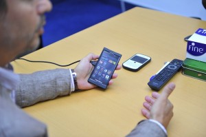
 With the much-hyped launch of BlackBerry 10 fast approaching, Computer News Middle East was treated to a sneak preview of RIM’s upcoming operating system. On hand to take us through the features was Chris Corsi, Country Director for the UAE and Oman, RIM, who insisted that there was still much more to be unveiled, come the January 30 launch.
Even so, going on the back of this Dev Alpha B version, a prototype released in September 2012, BlackBerry 10 looks like it could be something special. Corsi claimed that the overall response had been very good, and that developers in the Middle East were keen to come on board.
Indeed, he said that the response from developers had been so good that, at the grand unveiling, RIM will be able to release the biggest number of new apps ever seen on a new platform.
BlackBerry 10 really can be counted as a new platform, as it is RIM’s first QNX-based platform. What’s more, the look and feel of the OS is massively different to what’s seen on the firm’s current range of all-touch smartphones. It seems slicker, faster and more intuitive, straight from the off.
First impressions

The home screen makes the device look similar to any Android-based smartphone. The digital clock is at the centre-top, under which is the date and any upcoming calendar events. To the right-hand side, there are three buttons from “the hub”, in which the likes of social media, emails and messages can be found. Corsi said that developers will eventually be able to integrate news apps and such into the hub, making it a sort of information centre within the device.
At the bottom-right of the home screen is a camera icon because, Corsi claimed, users want to be able to access their camera very quickly. In between all of these buttons, there is just space, which users – we presume – will be able to fill up with their favourite apps.
To really “get into the device”, it’s a simple matter of sliding a finger up from the bottom of the screen. This will peel back the home screen to reveal the most recently used apps. It may be slightly gimmicky, but the animation is seamless and slick, making the motion very cool, if nothing else.
The recently used apps screen consists of four identical panels, each one showing a peek into whichever app it is linked to. The weather app, for example, will still be up to date in this view, as will the messaging app, meaning these panels are sort of like widgets.
The most recently used app is shown in the top-left spot. Scroll down, and all of the currently open apps can be seen in the same format. To close one, it’s a simple case of clicking on the little “X” at the bottom-right of each panel, though the point is that a user doesn’t have to close the apps that he or she uses most frequently. Corsi estimated that most users would have about eight apps running in this section.
The hub
 Click on one of these panels, and the app opens, which is no big deal. However, the device comes into its own when the user receives a notification while the app is open. Instead of having to close the app, it’s a simple case of swiping up and then sliding the current screen over to the right, which reveals a notification feed, or the “BlackBerry hub”.
The concept is similar to the drag-down notification viewer that’s found on any Android device or the more recent versions of iOS. However, on BlackBerry 10, it’s presented like a proper news feed. Each notification is given a decent amount of space, meaning that it can preview much more text. The icons on the left of each notification inform the user which app it is coming from – BBM email or text, for example.
To act on something that’s just come in, simply go to the hub, tap on a notification and it will take the user to the relevant app without closing whatever is currently open. Reply to the email or message, and then simply slide the hub to the left to hide it away again, leaving the app that the notification interrupted.
The system is much more refined than Android’s drag-down notification bar, and the device flips between screens seamlessly, making it a pleasure to use.
App, app and away
The recently used apps screen is clearly where most people will spend their time, as it will simply be a base for users’ favourite functions. To view all of the phone’s apps, simply slide the screen to the left to reveal the familiar array of apps listed in alphabetical order.
To fill this array up, users will have to delve into the new-look BlackBerry App World, which is much more pleasing to browse through. Trending apps and games are featured in the top row and the top grossing apps and games take up the two rows below. The apps are represented by the same sorts of app icons as found on any smartphone’s home screen.
There are more categories to be found below the top two rows, and they’ll eventually be populated with all of the new apps that are due to hit the store on January 30. Corsi claims that there are currently two apps being produced every day worldwide, and no doubt that number will climb once the public gets its hands on the device.
Getting to know you
 BlackBerry 10’s so-called Active Planner is certainly a highlight. Like any planner, it allows users to key in meetings and events on any given day, as well as input where the meeting is taking place. However, it will also allow users to key in who is going to these meetings. Click on the name, and the device will bring up a feed with bags of information on that person, including Google search results, LinkedIn updates and – if the person is a Facebook friend – recent Facebook updates.
Given that people put so much information about themselves on the web, this is an ideal way of harnessing that information, particularly when going to a meeting with anyone the user doesn’t know very well.
Speedy browsing
BlackBerry 10’s Internet browser is seriously quick, and promises a very enjoyable browsing experience. Though Corsi wouldn’t go into the details of how it was built, he did demonstrate a simple HTML5 test, on which the device scored 478 out 500, plus 11 bonus points. The Samsung Galaxy S3’s browser, by contrast, scores 409 plus three bonus points.
“If your phone scores higher than this one, I’ll give you a BlackBerry 10,” Corsi joked.
Typing
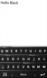
 One of the most widely reported features of BlackBerry 10 is the new keyboard function, which is heavily updated from the last OS’s. Start typing a word, and suggested words will pop up in between the lines of letters on the QWERTY keyboard. To select that word, simply swipe up on the key that it’s above.
Predictive text is nothing new, but what’s interesting about this system is that the system is extremely easy to get used to. What’s more, the predictive text really does do well to offer the words that the user is looking for.
It goes beyond that, too, as it will also come up with suggested words when typing entire sentences. So when typing “How”, for example, it will assume that the next two words will be “Are you”. Of course, it could be wrong, but it’s so unintrusive that won’t matter if it gets things wrong from time to time.
To view numbers punctuation marks, simply click on a button at the bottom-left of the screen. The main keyboard is only made up of letters, a comma and a full-stop, so users will no doubt be making use of this sub-keyboard often. There is no question mark on the main keyboard, which could be annoying for any users who ask lots of questions via text or email. Aside from this omission, though, the keyboard is extremely well sorted.
The unknowns
Certainly one of the most innovative features that Corsi hinted at was the ability to split the device between personal and business use. When giving out BlackBerry 10s as company phones, he said, businesses could place all the limits they like on the employee’s account. However, the employee could also set up a personal account on the phone, and switch between the two, which could have different home screens, different apps and different data.
Crucially, it’d mean that, if an employee departed, the company would only be able to remotely delete the data under the professional account. The personal account’s data would stay completely in-tact. Unfortunately, this function was not included in our sneak preview.
Meanwhile, Corsi would not comment on the hardware specifications of the new device, stating that we’d have to wait until the January 30 launch to find out. He did, however, say that there are many more features for users to sink their teeth into on the final device. Again, we’d have to wait until the launch to find out what they were, he said.
Corsi also refused to comment on whether or not BlackBerry 10 would be licensed out to other smartphone manufacturers.
The verdict
It’s been impossible to ignore the news stories surrounding the trouble RIM has run into over the past year or so, meaning it would be easy to dismiss BlackBerry 10 as another one of the company’s dying breaths. However, the operating system is so far above the firm’s current touchscreen offerings that it could change RIM’s fortunes considerably. Even in this prototype form, BlackBerry 10 could wipe the floor with a number of mid-range to high-end Android phones, and even give the iPhone a run for its money.
Going on the back of this preview, it would seem that the BlackBerry 10 launch will more than live up to the hype. What’s more, it will show the world that there’s life in the old firm yet.


