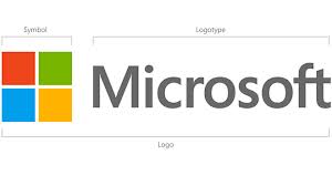
Microsoft has announced a new and streamlined corporate logo, the most radical overhaul to the company’s public image in a quarter of a century.
Since 1987, the company’s official logofont has been the company’s name in Helvetica black italic, in later years increasingly used in conjunction with the wavy four-colour Windows icon above or beside it.
The new logo renders the company name using the Segoe font (Microsoft’s contentious version of an original Monotype Imaging font) previously used to brand some applications products, with the Windows symbol beside it in flat, coloured tile form.
“The Microsoft brand is about much more than logos or product names. We are lucky to play a role in the lives of more than a billion people every day,” the company said in its online announcement.
“The ways people experience our products are our most important ‘brand impressions’. That’s why the new Microsoft logo takes its inspiration from our product design principles while drawing upon the heritage of our brand values, fonts and colours.”
The new design has already taken its place on the Microsoft.com domain as well as well as in the company small but expanding clutch of retail stores.
The new look underlines how seriously the company takes the forthcoming Windows 8, almost as if it’s a corporate relaunch of sorts. Under pressure, Microsoft needs to rebrand itself to compete with younger rivals (and in the case of Apple, an equally old-but-younger-seeming rival).
To put the re-design into context, the company’s first and incredibly alien-looking logo lasted from the company’s founding in 1975 until 1979. A second ran for only a year, 1980-1981, while the third from 1982 to 1986. The succeeding image did its job until now.
The company also sometimes varied the logo slightly for product packaging.


