 Redington, the $6 billion distribution and supply chain provider for international brands in the IT and mobility sectors, has unveiled its new global brand identity – a new logo and tagline – ‘Seamless Partnerships’, earlier this week.
According to the firm, as it steps into its 25th year since inception, the new branding builds on Redington’s well-established reputation in the industry.
The new brand identity reflects the core values of Redington as a contemporary and innovative company, which has developed its messaging strategy to reflect its evolution as a brand and its global role as one of the largest provider in the supply-chain solution industry. The distributor said that the new logo and tagline epitomises the new direction that the company would like to take in the years to come.
Redington’s managing director, Raj Shankar, said, “I am proud to launch our rejuvenated brand and visual identity that fully reflects what we stand for as an organisation. This is not a mere change of brand identity but a coming of age for Redington, a transformation that the company is engineering to take it to the next level. The new identity carries forward our core values on which our company is built – adaptability, collaboration, know-how, objectivity, simplicity, transparency and trust. We look to expand our horizons from being a ‘Brand behind brands’ to a platform that enables ‘Seamless partnerships’.”

He added that Redington is committed to do everything to achieve its ultimate goal of being the preferred company for connecting buyers and sellers.
“Re-emphasising the word ‘Preferred’ as in a competitive world, Redington wants to build and grow lasting partnerships,” he said.
According to the company, the new logo symbolises synergy – while the existing colour green has been retained, different shades have been introduced as well, keeping in mind the ever-expanding portfolio and services of the company. It represents the synergy and oneness that Redington possesses as an organisation – be it with vendors, customers, team, the environment, technology and the ecosystem within its circle of influence.
The firm said, “The latticed geometric design depicts technological innovation as well as simplicity in complexity. The symmetrical form shows harmony between Redington and the other organisations that it collaborates. The energy is depicted in the reverse white lines, also representing the common thread of Redington’s philosophy and spirit running through the organisation towards a common good.”
The new tagline – ‘Seamless Partnerships’ – illustrates the way Redington does business and where the brand wants all its energies to be aligned upon, the firm said.
“Creating enormous value to the brands and partners that it handles and transforming from end-to-end supply chain management to a slew of services like marketing, data driven intelligence, solutions and consultancy,” it added.
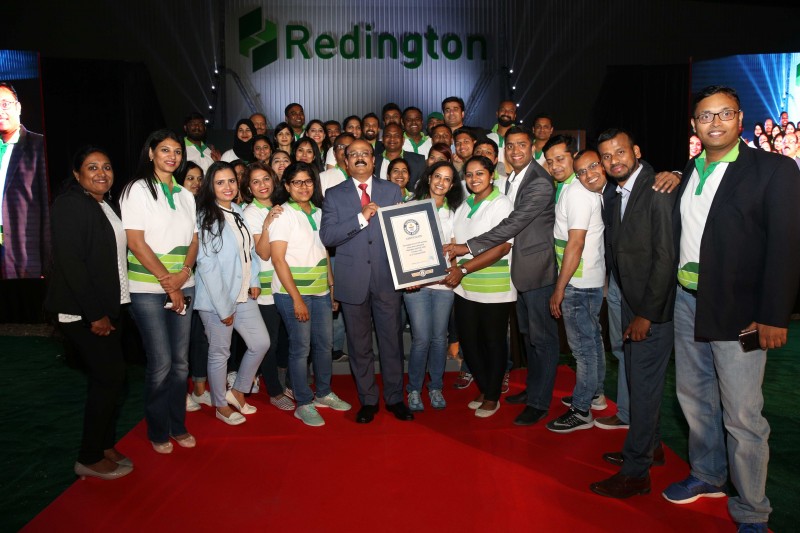
As part of the launch, employees of Redington based in Dubai achieved a new Guinness World Records title for the longest line of USB drives. The serpentine line had 12480 USB’s arranged to form the new logo of Redington. The event was streamed live over the Internet from Dubai to over 4000 employees of Redington globally.


